


Consultant Helps Clients Use Color to Send the Right Message
50 Shades of … Everything
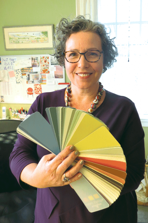
Amy Woolf
Amy Woolf, a certified architectural color consultant, says color can, and very often does, affect people physiologically and psychologically. And for these reasons, it’s very important to pick the rights ones, especially in business. Indeed, the chosen colors should reflect the products or services being sold, and the people selling them.
Amy Woolf says colors have long had meaning, importance, and symbolism; that’s not a recent phenomenon.
Centuries ago, she noted, royals and those in the clergy wore purple because that was a rare, very expensive dye, and thus that color translated directly into money and power.
And while they are still relatively few in number, individuals have been putting the title ‘architectural color consultant,’ or words to that effect, on their business card for some time now, she went on. In fact, there is a trade group comprised of such professionals — the International Assoc. of Color Consultants (IACC) — that has chapters all over the world; the one in North America stages classes once a year in San Diego.
But in recent years, color has seemingly taken on more importance in architecture, office design, and business in general, she noted, listing as reasons why everything from the growing number of colors (or shades of them, to be exact), to high-definition television, which brings everything into sharper focus; from the proliferation of decorating shows on TV to an increased emphasis — in business and in marketing — on sending the proper message, in part through colors.
These would be the colors on the walls, the company logo, the home page of the website, the business card, the fleet of vans or trucks, and on it goes. But much of her work involves commercial and residential real estate.
“To me, the most important thing is to unravel how someone wants to feel in a space, and how we can choose a color that’s going to have the right physiological outcome and the right psychological outcome,” Woolf said while trying to quickly explain what she does and how she does it. “Because color really does have a physiological impact; it changes our heartbeat, it changes how we perceive temperature, those kinds of things.”
There is such a focus on color now that Woolf — whose business is based out of her home in Northampton — and others in this profession make a decent living from what could certainly be described as a solid mix of art and science, one with many variables and focus points.
Indeed, just listen to this description of a job she worked on recently involving a lengthy search for the right color for the exterior of a commercial building in Amherst.
“The building had been brown, and the client was expecting me to specify gray,” Woolf told BusinessWest. “The tenants are diverse, including light manufacturing, a Comcast office, and a martial-arts school. The color eventually chosen, which sits between the blue of the sky and the green of the trees, settles into the landscape nicely, but provides a much more welcoming first impression than brown or gray would have. Heaven knows the world is not lacking for more brown and gray buildings.”
Also consider this summation of her work to “break a tie” among leaders at Greenfield Savings Bank concerning the exterior color for the branch on King Street in Northampton; two browns and a gray were under consideration.
“Their goal for the architectural design was to help increase the sense of a “walkable, village-like feeling for King Street,” she recalled. “I suggested they do a 180 away from neutrals and go with an olive green instead. I encouraged them to break up the monotony of gray and brown so prevalent in the King Street corridor with something fresh and friendly.”
Like we said, it’s a blend of art and what is certainly now a science.
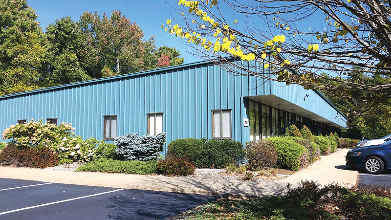
The exterior color chosen for this commercial building in Amherst “sits between the blue of the sky and the green of the trees,” says Amy Woolf.
And one of the key aspects of this work is working in partnership with the client, said Woolf, adding that the key words in those remarks above are ‘suggested’ and ‘encouraged.’
Indeed, Woolf says she doesn’t choose colors for her clients. She advises, explains the reasons behind this advice, and works to achieve buy-in. Ultimately, the client has to be more than comfortable with the decision, she said, and essentially own it.
“I explain to my clients why I’m choosing the colors I’m using,” she explained. “I’m as much a coach and a teacher; I don’t just come in and say ‘do this’ and ‘do this’; I’m always explaining why.”
For this issue, BusinessWest takes an in-depth look at the business of colors, or, more specifically, the art of picking the right ones.
No Black and White Issues
As she grabbed a large fan deck, this one created by Sherwin Williams, Woolf made an emphatic point about just how many colors there are to choose from by stopping in the ‘whites’ section.
It was not a short visit.
“Look at all of these whites,” she said as she flipped through the wheel. “And they all have a slightly different, subtle quality to them, and that’s where people get in trouble; they say, ‘I’m just going to paint white.’ But if it’s a pinky white, then they end up with pink walls.”
Helping people make sense of, and perhaps choose among, all those whites — and blues and greens and grays — is essentially Woolf’s stock and trade, only it’s much more complicated than looking at swatches and finding one that looks good, as she would explain in detail. Because ‘good’ is certainly a relative term in this discussion, and one with myriad meanings.
Other professionals involved in art, architecture, and interior design obviously work with clients on color selection, she noted, but this is all she does. She’s not sure if she’s the only certified color consultant in the 413 area code, but she does know that it wouldn’t take long at all to call the roll.
Nonetheless, hers is a vibrant business (that’s a technical term in many respects), and she quantified that by saying she’s generally juggling more than 20 clients at a time, with a healthy mix of residential and commercial, probably a little more of the former than the latter.
And her work, as she told BusinessWest, involves almost anything, design-wise and business-wise, that comes in colors. That includes flooring, window treatments, furniture, etc. (She noted that, when she mentions she’s a color consultant, many ask if this extends to fashion and coordinating one’s wardrobe; it doesn’t.)
“I liken it to an algebraic equation — everything’s a variable that all comes together in a certain way,” she said of most projects in both the commercial and residential realms. “As you tweak one thing, everything around it moves, so it’s good to look at it all at once.”
Like most of those who are certified architectural color consultants, Woolf was greatly influenced by the work of the late Frank Mahnke, who wrote the book on the subject — quite literally. It’s called Color, Environment & Human Response, and that name goes a long way toward explaining this profession.
Indeed, there are human responses to various colors, she went on, adding that these responses should help dictate which ones people, especially those in various businesses, should choose.
As she talked about all this, Woolf referenced the color chosen for the walls of her home office — called ‘cooking apple green.’
She chose it because she likes it and finds it comfortable to be in and around. But BusinessWest was among the very few people outside her family who have been in this office (Woolf obviously needs to do her work on location in almost all cases), so this played into the decision.
“This is just for me,” she said, adding quickly that it might be suitable in a traditional business office; that’s might.
“The important thing about color is that we do have these sort of prescriptive ways of talking about it — ‘this is good for business,’ or ‘this is good for a nursery,’ or ‘this is good for a bedroom,’” she explained. “But what that doesn’t really examine is the individual, personal relationship with color.
“For me, I find this green to strike the right balance between restful and having enough liveliness so that it’s somewhat energizing,” she went on, diving into the real science of her work. “But for someone who doesn’t really like green, it would be the wrong choice. So you probably need to think of it in terms of a bell curve — for a large number of people at the middle of the bell curve, this would be an acceptable color, but for some people who are maybe outliers, it wouldn’t work. The bottom line is that one needs to be careful not to generalize over colors that are ‘good.’”

For her new office in Agawam, Jean Deliso desired colors that make clients feel comfortable and convey a sense of trust.
So, just what goes into choosing the right color or colors, especially for a business setting? Woolf said it all comes down to how the client would like someone to feel in that space. Sometimes, that someone is the client themselves, but for a business that entertains customers, it’s more about how those individuals will feel in that space.
Business owners want that individual to feel comfortable, obviously, she went on, but often there’s more to it. In settings where the visitor might be anxious — a doctor’s office or any other place where delicate matters are discussed, for example — calming colors are required. Meanwhile, in most professional settings, like lawyers’ and accountants’ offices, colors that somehow generate trust and respect are preferable.
“In a commercial environment, you want to choose colors that send the appropriate message for the product or service being sold,” she said, adding that, while this sounds obvious, it is often an overlooked or underappreciated matter.
“I would never — OK, never is a big word … I would be unlikely to use trendy colors in an office or business environment where the message and the branding is that of solidity or trust,” she went on. “We talk about ‘IBM blue’ or ‘banking blue,’ the kinds of colors that create a sense of trust and reliability; we can use colors like that.”
And, as one might guess, there are, well, fine lines everywhere when one is talking about this subject.
Take yellow, for example. “It’s a very energetic color, it’s very buzzy; that’s why we paint school buses yellow, so we can see them,” she told BusinessWest. “But sometimes, people are sensitive to the level of energy in that yellow, and might think it’s overwhelming.
“In my training, we talk about this continuum of understimulation versus overstimulation,” she went on, “with understimulation being monotonous and boring in the environment, and overstimulation being so vivid, so bright, so much data that it becomes overwhelming and is too much. So what I want to unravel with my clients is, what does their environment call for in terms of that feeling?”
Hue and Cry
What this unraveling process has revealed throughout her career is that, while there are rules of sorts in this science and this business, they are not exactly hard and fast, and sometimes rules are made to be broken.
“The classic example is using a restful color in a bedroom,” she explained. “People want calming, soothing colors. But I did work for a physician who really wanted a wake-up call, so her bedroom is a soft orange, which flies in the face of those rules, or those shortcuts.”
One of those rules pertains to colors at opposite ends of the color circle, such as yellow/purple, red/green, and orange/blue. While celebrated artists liked to bring such contrasts together on a canvas, and doing so might work from a fashion perspective, it’s generally best to avoid such practices in a business setting, said Woolf.
“Color schemes that are high-contrast really don’t work,” she said. “Strong black and white, which arguably is trendy and in style in the architectural world, really creates eyestrain,” she explained. “My training says to keep the colors closer to the center and not to the extreme end of light and dark.”
However, strict adherence to the common practices of using all warm colors or all cool colors might not yield the kind of dynamic color scheme and interesting environment that results from working from both ends of the color wheel.
“You can do it, but do it just enough,” she said of contrasting colors, adding that this, in itself, is part of the art and science of this work. “That’s where the magic is.”
There are some other general guidelines to follow, she said, adding that it is wise, especially in a business setting, to focus on colors that work for that particular setting, meaning sending the right message, and not, as she noted earlier, colors that are ‘trendy’ at that given time.
Colors in that latter category now include turquoise and aqua, said Woolf, adding that, while they may be ‘hot,’ they still wouldn’t be suitable for a lawyer’s office. A pediatrician’s office? Well, probably.
However, businesses should look to avoid what she called “outdated” colors in order not to appear behind the times. Asked for examples, she listed dusty rose and Colonial blue.
“When we go to a doctor’s office, we want to feel like they’re up to date on everything — they’ve got the latest equipment and the newest science,” she explained. “If the color schemes are holdovers from the ’80s, you’re not really sending that message.”

Amy Woolf says the colors in the conference room at Deliso Financial were chosen to have a calming effect.
While talking about colors in the hypothetical can he helpful, Woolf said an actual project from her portfolio might help put matters in perspective. She was right.
BusinessWest accompanied her on a visit to Deliso Financial Services in Agawam. Jean Deliso, principal and financial advisor, most recently served the magazine as a judge for this year’s 40 Under Forty competition. This time, the assignment was to explain how Woolf helped her make over her new space in the office building on Meadow Street Extension, and, more specifically, how and why the colors now on the walls were chosen.
And she embraced it enthusiastically because the walls of this space, formerly occupied by a pest-control company, were white (which shade she doesn’t know), and she wanted to replace this blank canvas with something that “said something.”
“This is a great space, but it needed a transformation,” she recalled, noting that she was essentially moving across the hall and into a bigger office. “Everything was white, and it was soooo non-inviting, and I need to have something inviting, and I needed help to do that.”
Elaborating, she said she desired something that was “comfortable and non-intimidating,” which is understandable seeing that she works in financial services, dealing with a subject that the vast majority of people would prefer to not talk about. She also wanted to convey professionalism and trust, two character traits required of those handling such work.
She hired Woolf, who has also done work at her residence, and who set to work picking colors that would convey all that. For one wall, she chose a color called Wilmington tan, which is kind of like beige, but a little richer (“people think of beige as insipid, but this has a lot of depth to it”), because it has a calming effect.
For the back wall, the one a client would be looking at if he or she were sitting across Deliso’s desk from her, Woolf chose something called Newburyport blue.
Deliso likes the name — she’s a sailor (paintings of boats dominate her walls), and Newburyport is right on the water — but likes the color better. It complements the IBM blue on her business card — sort of — and that’s by design, said Woolf, who noted that Deliso had a much brighter blue (like the shade on her business card) on the walls in her old office. And that wasn’t exactly working, at least in her judgment.
“We toned the blue down a little bit,” she explained. “Because what looks great on letterhead doesn’t always translate into a comfortable wall color. We can use those brand colors as an inspiration, but you don’t, or shouldn’t, just pull it off a card and stick it on a wall.”
Elsewhere in the Deliso Financial suite, Woolf used Providence olive in the conference room, again to create comfort and a sense of ease among clientele who might be nervous upon entering, especially for the first time, and carefully positioned Deliso’s many awards and news clippings on what the client calls the ‘trophy wall,’ again to convey professionalism and generate confidence.
When asked if all this focus on color was worth the time and expense, Deliso issued an enthusiastic ‘yes’ that speaks to why Woolf’s schedule is pretty tight these days.
“My clients feel very comfortable here; they enjoy coming here,” she explained. “They feel great when they come here, and it’s a good experience, and I think the colors play a very big part in that.”
Positive Tones
In her next life, Woolf joked, she wants to be the one who gets to assign names to all those colors on the wheel — like ‘cooking apple green’ or even ‘Bedford Stuyvesant boiled chicken,’ the name one client attached to a wheat-like color she eventually chose for her summer home.
For now, though, she’s content to work with all those hues and, more to the point, help clients choose the right ones — like the color on that building that “sits between the blue of the sky and the green of the trees and settles into the landscape nicely.”
It’s rewarding work on a number of levels, one that has made for a colorful career to date, in every sense of that phrase.
George O’Brien can be reached at [email protected]